
With the release of the new ePayslip app, we introduced some cool new features, and one of our favourites is our take on the digital payslip. Our approach was to redesign the traditional print payslip and optimize it for a digital screen. Whether you're viewing your payslips on your phone, tablet, or PC, the experience of viewing your payslip is vastly improved.
Dissecting the print payslip
Employers are required by law to produce a payslip for their employees on or before payday. But we admit the traditional print payslip is outdated and uninspiring. In addition, trying to view and read a conventional payslip on a phone screen is frustrating because they are not normally designed to be viewed this way.
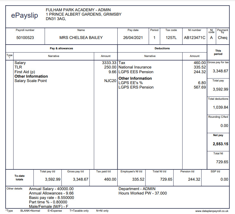
Fig1 - example print payslip
Design problems with the traditional payslip
- Typically the values are set in relatively small text and are hard to read.
- Most of the headings are the same size, so there is no hierarchy to guide your eye to what is most important to be read first.
- They are often so busy and packed full of data it’s hard to scan to the parts you are interested in
- They contain a lot of information that you may already know, like your name, NI number and job title, making it a busy place.
The payslip in Fig1 has 32 different pieces of information for our user to scan through:
- Company address
- Company name / logo
- Employee Payroll number
- Employee Name
- Pay date
- Period
- Tax code
- NI Number
- NI Code
- Payment method
- Pay and allowances
- Deductions
- Gross pay for tax
- Total pay
- Total deductions
- Round C’Fwd
- Net pay
- Total Ni
- Total pay t/d
- Gross pay t/d
- Tax paid t/d
- Employee’s NI t/d
- Total NI t/d
- Pension t/d
- SSP t/d
- Annual salary
- Annual allowances
- Basic pay rate
- Part-time
- Gender
- Department
- Hours worked
Heuristics
In User Experience Design (UXD) and particularly in performing usability checks on systems, we use Heuristics checklists. One of the most used lists of heuristics is Nielsons 10 Usability Heuristics. The guideline that we focused on; is Heuristic no.2. “Match Between system and the real world”.
“The system should speak the users' language, with words, phrases, and concepts familiar to the user, rather than system-oriented terms. Follow real-world conventions, making information appear in a natural and logical order."
The later part of this heuristic is what we will focus on in this blog, “follow real-world conventions and make information appear in a natural and logical order to demonstrate empathy and acknowledgement for users”.
Follow real-world conventions
A decision was made early on in the design process. Rather than viewing the print payslip on a phone-sized screen that would leave the text size illegible, we would create a Skeuomorphic payslip. Skeuomorphic means creating an interaction that mimics one from the real world.
For instance, for your “Desktop” in Windows on your PC, the Designers took a real-world convention of a user working at their desk, with their desktop which may have some folders on, and within those folders they have files, and next to that is a trash bin. These everyday interactions have been taken and used to create a Skeuomorphic desktop on your PC, with the familiar logic that makes it easy to understand and use.
Humans have an instinct to trust familiarity, and with the re-design of the payslip, we use this familiarity to guide our approach.
We created a digital payslip on your mobile screen that shows up monthly (or whatever your pay frequency is), and just like your print payslip, it houses all your payment information, but with optimized formatting to be readable on your mobile screen size, your tablet screen size or any other digital screen.
Instead of just taking the traditional print payslip and making it fit into a small screen, we used our users' familiarity with the print payslip and created a digital one that mimics its interactions.
Make information appear in Logical order
For information to appear in a logical order on the payslip, it needs to appear in a logical order from the users’ perspective (the employee), so an analysis phase was undertaken. As part of that, we used a top task analysis to try and understand what the user wants from their payslip:
- See what amount has landed in my bank on a payment frequency basis
- Check deductions are correct on an ad-hoc basis
- Check how much tax (deductions) I am paying on an ad-hoc basis
- Check a specific deduction or addition, like a pension amount, on an ad-hoc basis
It quickly became evident that the digital payslip’s logical order should enable users to undertake their most common tasks with speed. So the payslip was optimized with the user’s top tasks.
Focusing on the user’s top tasks allowed us to understand what information is needed and when allowing us to optimize the payslip information according to the user’s logic.
This cut out all the extra information the user did not need immediately and focused on what the user wants to achieve now; any further information could be assessed as a next step, cutting out the clutter and giving the interface focus.
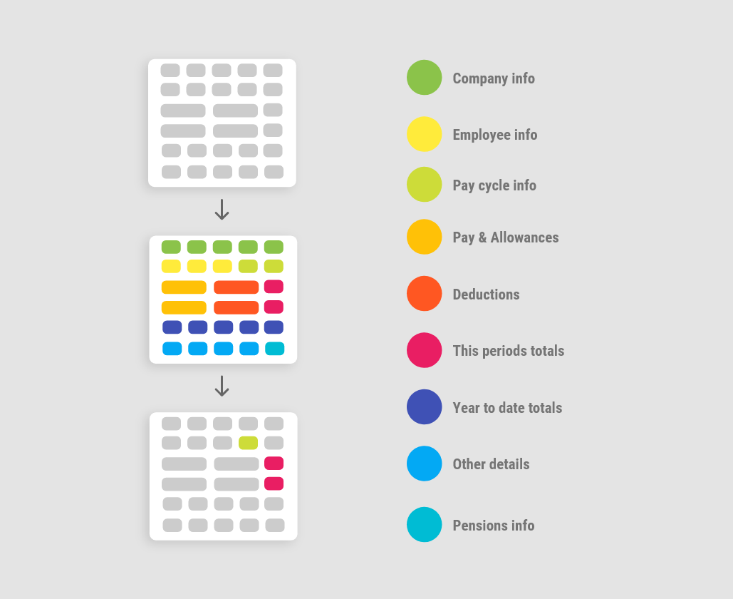
Fig2 demonstrates the print payslip vs the optimized digital payslip

We have cut the information down from 32 pieces of data down to 4 key pieces of information that would allow our user to undertake their top tasks efficiently:
- Pay date
- Gross pay
- Deductions
- Net pay
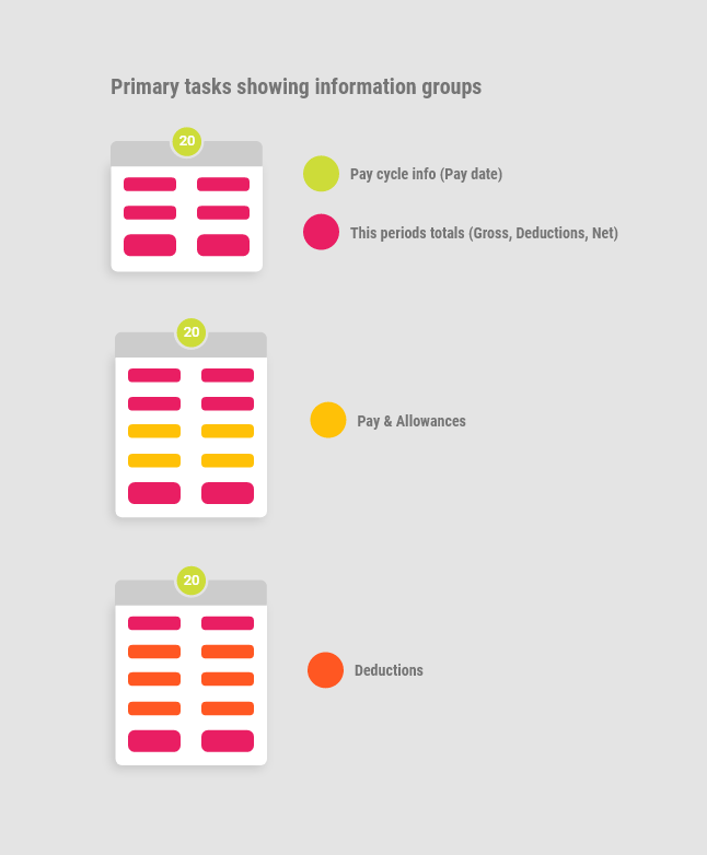
After initial analysis, we also noted that there were roughly nine groups of information on the print payslip and that our new logical order required two groups; Pay cycle info and this period's totals, to enable our users to undertake their primary tasks:
Fig 3 shows the process of grouping the payslip information
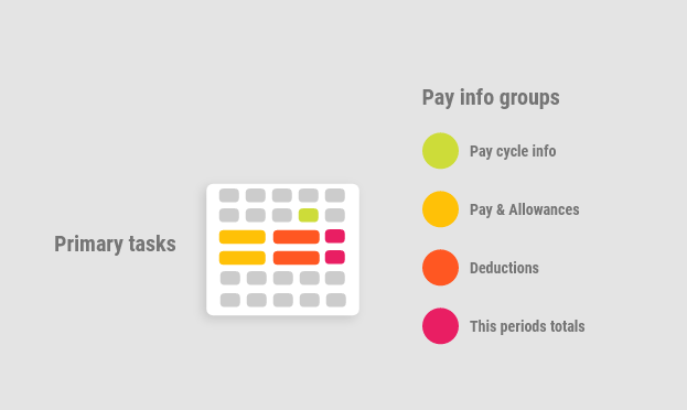
Top tasks (or primary tasks) are placed in an expandable content area on the payslip and contain more in-depth information on pay, allowances, and deductions.
Secondary user tasks
We also identified some secondary user tasks, which include:
- Check year to date details on an ad-hoc basis
- Check pension details on an ad-hoc basis
- Check other payment details on an ad-hoc basis
- Check company info on an ad-hoc basis
- Check employee info on an ad-hoc basis
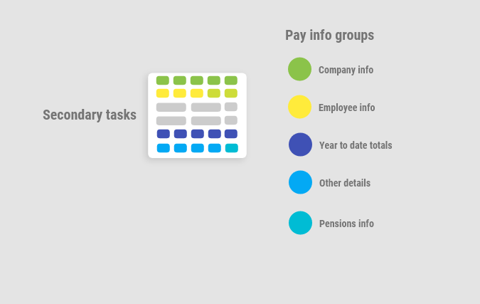
Secondary tasks are placed in an expandable secondary content area on the payslip and contain Employee info, year to date totals and other details, including Pension.
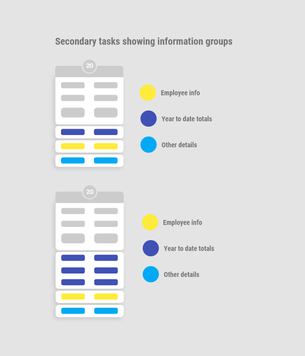
Each secondary content area is placed in an expandable accordion. The user can access these content areas but only show a highlight of their content until users click on them to expand, then see the complete information.
New Widget features
The expandable feature of the secondary content areas or widgets - allows us to add more in-depth information or even interactive elements without bloating the user interface. In the future, we could create a Pensions widget, Notes Widget and the payslip should still retain its ease of use and focus on the users’ top tasks.
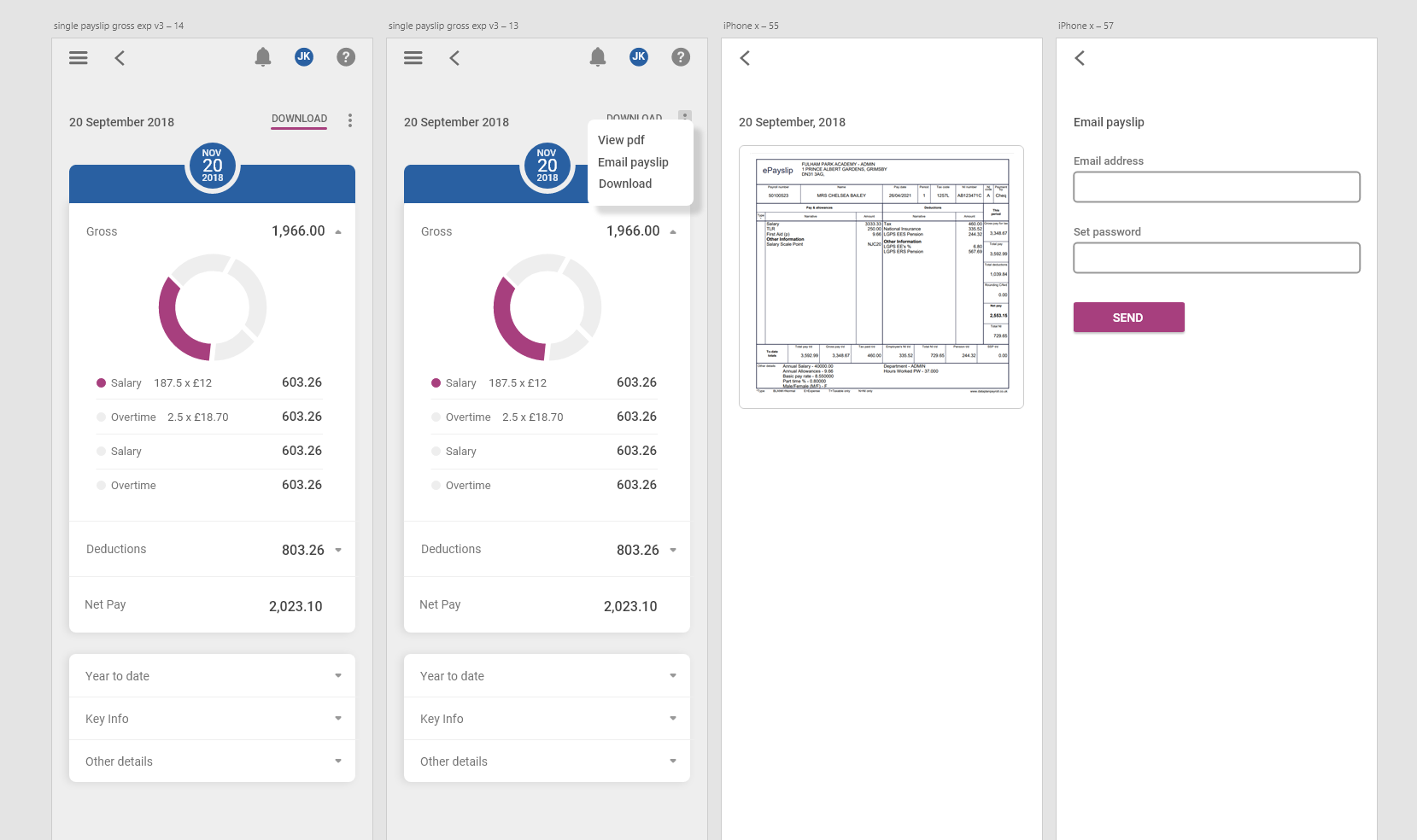
Accessing print payslips when needed
With all this talk of optimal displays and interactive elements, we still want to assure our Employees that as part of each digital payslip, you can still access, download and email the old traditional print payslip typically, they may use these print payslips for proof of a loan or mortgage, and some employees may still like to download and backup all their payslips.
We hope you enjoy using the new digital payslip, and we will be iteratively improving the user interface over time and adding new features.